


Adobe Mobile Apps
Recently, Adobe announced a library of mobile apps that tie seamlessly into your Creative Cloud library, which has also been updated to store preferences, libraries and assets up to the cloud, which means it follows you around to wherever you are working. The new apps are clever and innovative, and yet so simple it seems crazy that they weren’t thought of before.
The first app on the list is Adobe Color. For most artists and designers, color is an important and frequently misused component of the creative process. Complimentary. Tertiary. What color schemes should you use? Well, they are all around you — thought of and deliberated on by the best designers in the world. Architecture. Cars. Consumer-product ads. Movie posters. But when something jumps out at you, how would you remember the colors? Using the camera on your phone, Adobe Color analyzes the colors and boils them down to a Kuler color palette. You save the palette. It gets stored in your Creative Cloud library for safekeeping. Now when you need inspiration, you can tap into that library and have the exact colors that originally caught your eye.
Neat, huh?
Adobe Brush works in a similar way but is a little more fancy schmancy. Say you like the look of a particular pastel chalk or an oil paint stroke or a crack in the road. Just like Adobe Color, you use your camera to take a photo of that mark. From there, you can edit various parameters to get a look you like, and even setup the look of the head and tail of the stroke. Once you get something you are happy with, save it to your library and it becomes a new brush available to you in Photoshop or Illustrator – again, anywhere you login to your Creative Cloud account.
The third app also uses your mobile camera and it the most magical of all. Adobe Shape lets you take a photo and it will process that photo into vector art, ready and uploaded to your library for use and manipulation in Illustrator or Photoshop.
Granted, most of these thing you could do before – but never so fluidly and never so simply. And it’s all free, with your Creative Cloud subscription.

Maya Extension pack
Earlier this year, Autodesk released its latest suite of media and entertainment products. I recently looked into the extension release of 3ds Max, and I was holding off on Maya until its extension release because, quite honestly, I was trying to avoid discussing the much hyped Bifrost. The reason being that it’s a very ambitious project being led by incredibly intelligent people. But, in my humble opinion, it was released before it had matured. So, I’m going to give it a little time to grow up before really digging into it.
Now, on to more positive things. In the 2015 release, we saw a lot of new tools: some brand new, some that were released in the previous extension pack. XGen is quickly finding its way into productions as well as the new Bullet solver for Dynamics. And I adore the QuadDraw tool for retopologizing. However, in the recently released extension pack, like its sister, 3DSMax, Maya has a couple new features that aren’t particularly shiny, but for the industry, I believe they are muy importante.
Color management is a difficult topic to wrap your head around. I’ve been dealing with it for over a decade and I still have to occasionally turn to people with a Ph.D. to answer some of my questions. I can’t say that Maya’s latest solution is the end all, be all in color — frankly, because the debate about a color standard still rages on behind closed doors. But it is moving in the right direction. Autodesk could have simply put out some color tools to allow one to bring in LUTs and color profiles into the system so that when you rendered, you’d kind of get close to where the production needed to be. But they didn’t stop there. They took steps by using the Viewport 2.0 technology to let artists visualize how their scene is going to end up — in the viewport. It may not seem like much, but it’s got it where it counts.
Not to be upstaged by the eccentricities of color science, the technical directors get another tool to make them happy in the form of a Performance Profiler. You know when you have a scene that it playing back just fine, and the something small changed and Maya’s performance plummets. Troubleshooting is a problem. So Autodesk threw in an analysis system that charts the activity of the scene as it plays back and gives you a rundown of what resources were doing what, when and for how long, thus providing a snapshot to TDs so they can go back to the animator and say “try turning that off.” Again, may not seem like much, but you multiple the number of seconds wasted by the number of animators by the number of days on a project, and it adds up.
Good job, Autodesk, for making strides in solving some very deep-seated problems in lieu of fancy stuff that look cool but don’t add much. I promise I’ll get to the sexy features on the 2016 release.
Toon Boom Harmony
2D Animation is a tough gig. It’s time consuming, laborious, and frequently tedious. So any tools that help get through the rough stuff and get us to the art is a boon. Toon Boom definitely has been around long enough and has established itself in this niche deep enough that it knows where to place its efforts.
Harmony, Toon Boom’s flagship software, is up to version 11 now, yet despite its maturity, it is still evolving. Among the myriad of advances, I’m just going to focus on some of the major pieces.
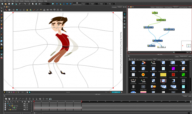
There are upsides and downsides to using raster and vector brush strokes. So, Harmony has blended them together. You can mix and match layers and styles so that, for instance, you can have a layer with your line art as a bitmap layer and get that sketchy or textured look that blends with the colors around it, but then have a layer beneath that for the colors in which the swatches of color filling your character are vectors. Or vise versa, with a very clean vector line, but a painterly bitmap color fill. Each combination is smashed into your working layer as two sub-layers – just so things don’t get too crazy trying to manage those layers if your line and fill were separate.
Layers aren’t absolutely dedicated to their style as there are tools to convert bitmaps into vector layers, along with ways to reduce the number of control points after the trace happens. Anyone familiar with tracing in Adobe Illustrator knows exactly what I’m talking about.
The other tool I know will be extremely beneficial to animators is the mesh warp tool. I know because I use the same tool with reckless abandon in my comps in Nuke. Essentially, you have a grid of points, the density of which is user dependent, which can be used to push and pull your artwork … and animate those changes. Large, gross movements to subtle changes of a facial expression can be tweaked without having to go back and change the drawing itself.
Additional features in Harmony 11 include new UI changes to more clearly indicate frame parameters within the timeline itself — like the difference between key frames and in-betweens. Custom coloring is present all over the interface, but specifically in the network view — and by network view, I mean the node system that Harmony uses which will be completely familiar to Nuke, Fusion and Houdini users.
Harmony is a robust, full-featured animation system with all the bells and whistles. And those bells and whistles come at a price. If you are really serious about your animation production, however, and have a team of animators, definitely look into it for your next animated short or feature.


